


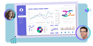


Data visualisation in finance has evolved with the ever-changing nature of data and the users who produce it. With the help of various data visualisation tools and their capacity to streamline financial analytics, analysing financial data on dashboards has become extremely convenient.
Teams across various industries, ranging from hardware to technology, utilise real-time data, whether financial or otherwise, to gain deeper insights and uncover hidden trends. By using multiple data sources organisations can achieve complete visibility into their finances.
The visualization of data not only expedites financial reporting but also empowers analysts with greater control over insights. This shift allows finance teams to allocate more time toward profit-driving strategic initiatives, reducing the need for extensive data preparation. To aid your data team in creating impressive graphics, we have curated a list of the top data visualisation tools available in the market.
Why is Data Visualisation Important?
Utilising data visualisation tools to analyse past accomplishments and forecast future projections is an effective approach, especially considering the potential inaccuracies and human errors that large databases may contain if manually analysed. Digital tools play a crucial role for companies heavily reliant on data, providing them with the necessary means to ensure accuracy and enhance decision-making.
The advancements of these tools allow companies to graphically represent information, making it simpler to comprehend, analyse, and draw conclusions for strategic use in business. Visualising data might provide useful insights your team would not have discovered otherwise.
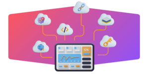
The prevalence of big data is undeniable, and to effectively analyse it, businesses should adapt data visualisation tools such as Tableau, Domo, and others based on their specific needs. These user-friendly tools offer a wide range of options for data visualization, empowering users to derive meaningful insights from complex datasets.
Types of Data Visualisations for Financial Decision-Making
Colours and patterns have a way of capturing our attention. Red and blue, as well as squares and circles, are easily distinguishable. Another form of visual art that captivates us and holds our focus on the message is data visualization. By looking at a chart, we can instantly perceive trends and outliers. When information is visually presented, we can quickly internalize it, as it becomes a narrative with a purpose. If you’ve ever attempted to identify a trend in a vast data spreadsheet, you understand the significant impact a visualization can have.
1. Graphs And Charts
In a line graph, the values are represented by lines drawn between the two axes. Data visualisation through graphs and charts can be used to monitor developments over a relatively short or extended period. While the shifts are relatively small, line graphs are preferable over bar graphs. The multi-line graph option is usually used to see how many variables have changed within the same period.
Businesses can use graphs and charts to monitor important financial KPIs, including liquidity, budget, expenditure, and cash flow. It will allow them to manage risks effectively, leading to stable finances and increased productivity.
For a tech business to operate at its maximum potential, it must prioritise frequent financial analyses and effective data management. Where businesses are not able to work with their Tech Accounting Firm to build unified dashboards, they should hire a specialist data analyst.
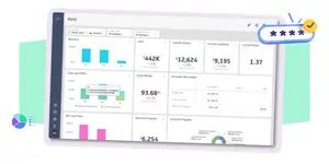
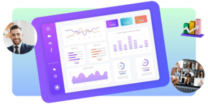
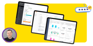
2. Dashboards
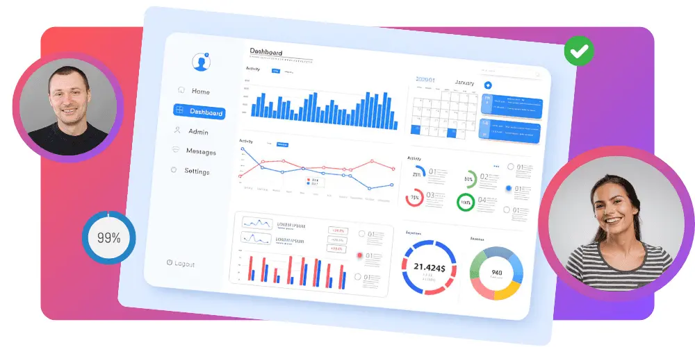
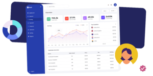
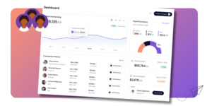
A financial dashboard is a tool that provides a graphical representation of your financial data, making it much simpler to comprehend. CFOs, their staff, and business partners typically utilise financial dashboards to monitor key financial and operational indicators and KPIs in real-time. You may customise such dashboards to meet your specific requirements.
Financial dashboards serve as visualization tools that offer real-time insights into crucial operational and financial information for chief financial officers, their teams, and partners across various business divisions.
Key performance indicators (KPIs) are the backbone of strategic, forward-looking decision-making, and a solid sales and marketing financial dashboard provides management with visibility into these KPIs.
3. Heat Maps
Data such as sales, product use, or financials may be helpful to a business and can be represented visually using a heat map. Visual heat maps allow businesses to show data with colour shading instead of just numbers and spreadsheets. In addition to displaying the geographical distribution of current results, heat maps can also point the way to future growth hotspots.
While analysing the current data, businesses may use heat maps to see where their consumers are concentrated, where they fear market saturation, and where sales have slowed down.
In the business world, heat maps can be made using internet tools. These cloud-based applications make it easy to see a company’s location on a map, with only an address uploaded from a spreadsheet or database. When you input your data and desired locations, such applications will instantly produce a heat map.
Discover how cloud accounting apps can significantly enhance business performance
4. Treemaps
Treemaps are visualisation diagrams used to display hierarchical information. They consist of progressively larger rectangles, each representing a different data value. The size of each node in a data tree is represented graphically by the area of a rectangle, with larger rectangles representing longer branches of the tree.
Treemaps are a method of representing hierarchical data sets in a visual format. They can pick up on the data from
- Individual values and
- Hierarchical structures.
Most data visualisation now includes treemaps. Designers often use them as a means of breaking up a dynamic dashboard. Treemaps can be useful for visualising data but are also a difficult representation that presents numerous barriers to rapid understanding.
Sales data is commonly used for treemaps because they accurately depict the relative proportions of data categories, making it easy to identify the most important factors in each group quickly. Items failing or outperforming their peers in the same category may be easily identified by their colour.
5. Scatter Graphs
Business managers employ the scattergraph technique of cost estimation to foresee operational expenses at varying activity levels.
The technique’s name comes from how the graph appears in its whole, which is a collection of random dots. Yet, the simplicity of the procedure comes at the expense of accuracy. In a perfect world, the outcome of a scattergraph analysis would be a formula that included the overall fixed cost and the variable cost per unit of activities.
Best Practices for Using Data Visualisation Tools
If you want your visualisations to be clear and useful and your insights to resonate with your audience, follow these guidelines. All right, let’s get this party started.
Identify the Right Metrics
Remember that there is no universally correct data visualisation method; instead, you should think carefully about your aim and choose a style that best conveys the narrative and answers crucial issues the data raises.
It’s good to occasionally combine relevant graphics since this may spur more investigation and provide actionable business insights and solutions.
The most well-liked forms are:
- Bar Charts: One of the most frequent data visualisations, bar charts are useful for comparing groups within a single metric. They shine brightest when dealing with information that can be conveniently partitioned into various classes.
- Bullet Charts: These were developed to replace traditional dashboard instruments like gauges, meters, and thermometers; they display progress toward a goal by comparing data.
- Line Graph: The line graph joins disparate data sets to show a smooth progression through time. The result is a quick and easy method of comparing and contrasting two values across time.
- Histograms: The distribution of your data may be seen and compared using histograms and box plots.
- Maps: Maps are indispensable for making sense of geographical puzzles and mysteries.
- Pie Charts: While less successful when used alone, pie charts are a great tool for supplementing other visualisations with more information.
- Explore essential Metrics for SAAS Businesses to understand which data visualizations can best represent key performance indicators unique to the SaaS sector
Choose the Appropriate visualisation Tool
Once you have determined the goals for your visualization metrics, it is time to consider the most effective methods. Depending on the specific scenario, leveraging code libraries or utilising no-code/low-code platforms can offer distinct advantages.
Developers, Data Engineers, Analysts, and BI Engineers use different data visualisation technologies. Among the most well-known tools in the field are
- Tableau
- Fine BI
- Power BI
- Domo
- Zoho Analytics,
- Google Data Studio
When choosing Accountants or Advisors, it is crucial for a creative business to understand how these services can be integrated into its current service stack to offer scalable business and financial solutions that a growing business needs on a time-sensitive basis.
Merely searching for an accountant based on location, such as ‘Accountants in London,‘ or industry specialization, such as ‘Accountants for Marketing Agencies,’ may not be enough. It is essential to explore their services to determine if their service stack is scalable and can cater to the advisory needs of your growing business both in the present and future.
Keep It Simple and Easy to Understand
Well-executed data visualisation should be informative but also interesting and clean. An overcrowded representation might detract from the intended message. Use simple layouts and leave out any optional info to enhance your visualisation’s readability.
Too many labels, irrelevant data points, and distracting backdrop pictures and patterns are all unnecessary items. Ensure the labels and captions are clear and there is enough white space around the charts and other elements. Avoid complicated layouts and instead highlight the key points you want to make.
Use Colour Effectively
To put it simply, colour matters. It says a lot without saying a word. Yet there’s a fine line for employing colour, so simplicity is key. Highlight and emphasise the data by using color. If you use a lot of different colours, it will seem chaotic, but if you use one colour or a lot of different tones of the same hue, the information will become difficult to distinguish. The meanings we attach to different colours are also significant.
To speed up the reader’s processing of the information, choose colours that are natural to the reader’s mind. Use red to represent hot temperatures and blue for cool ones while dealing with thermometers. The choice of colours has significant implications as well.
To demonstrate uniformity in results or to emphasise differences in the data is useful. to be paid in the future. Due to its diverse nature of fixed and variable components, analysing a semi-variable cost requires additional work.
Tell a Story with Your Data
Data visualisation is invaluable for crafting an engaging data story that readers will grasp. Data visualisation provides evidence to support your assertions by setting the stage, drawing attention to key points, revealing key insights, and prompting the audience to take action. Your offered metrics go far beyond simple charts and figures to provide an understanding and explanation at the narrative level.
The most effective method of data storytelling is to use the appropriate data presented in the most appropriate visual manner. Too many pictures turn your narrative into an infographic, lacking the necessary context to be interesting. Storytellers need to construct a tale and know when to include details, when to emphasise complicated figures, and when to stick to the written word.
Although data visualisations are useful, they only provide additional details to the tale.
Examples of Data visualisation Tools for Financial Decision-Making
Although the specific features of each data visualisation tool may differ, they all have the fundamental ability to take a dataset and allow for its visual manipulation.
Tableau
Tableau’s popularity as a data visualisation tool stems mostly from two factors: It can do much work with little effort.
You can import data from various sources, and the program can generate various visualisations, including charts, maps, and more. Salesforce now owns Tableau, a business intelligence platform with a large user base and active online community.
Tableau has several solutions available, including a desktop version of its analytics solution, a server version, a web-hosted version, and a CRM package.
There is also a free version called Tableau Public. However, remember that the public can see your visualisations if you use the free version. It makes it a decent choice for becoming acquainted with the program’s fundamentals, but not for any confidential or private information.
Microsoft Excel and Microsoft Power BI
In its purest form, Microsoft Excel is not a data visualisation tool but a spreadsheet program. Nonetheless, its data visualisation features are very helpful. As many large businesses rely on Microsoft software, you could already have access to it.
Microsoft claims that you can create at least 20 distinct kinds of charts in Excel by using the software’s spreadsheet functionality. Bar charts, scatter plots, and pie charts are some of the more popular types, while radar charts, histograms, and treemaps are examples of more complex visualisation methods.
Excel’s capabilities for data manipulation are limited. Power BI is a fantastic alternative to Excel if your company needs a more robust data visualisation software but prefers to remain in the Microsoft environment. Power BI was developed as a means of analysing and visualising data; thus, it can take in information from many different places and produce charts and graphs in many different forms.
Google Data Studio
You’ve probably used Google Documents and Sheets before, but have you tried Google Data Studio?
The free program facilitates the creation of visually appealing and easily digestible reports from various data sources.
In addition, Data Studio is simple to use; no prior experience with programming or knowledge of SQL is required. Data Studio’s pre-built data connections take care of the data authentication mechanisms and access permissions so that you can focus on calculating, transforming, and visualising data. It may also transform unstructured data into the metrics required for well-organised reports and dashboards.
And much like with other Google products, you can collaborate to develop content by editing and managing feedback, dashboards, and reports internally and externally.
Customization of charts, graphs, colours, forms, photos, and logos is as simple as dragging and dropping.
Zoho Analytics
Professionals interested in visualising company information will find Zoho Analytics an invaluable tool. Sales, marketing, profit, revenues, expenses, and pipelines are typical focus areas for its user-friendly dashboards.
Depending on your requirements, Zoho Analytics offers a variety of premium plans. A free edition lets you create several reports at no cost, which is useful for trying out different options before committing to one.
Companies’ sales and marketing departments might find various alternatives to Zoho Analytics.
Domo
Domo is a business intelligence platform in the cloud that provides an end-to-end answer for managing, analysing, and visualising data. The software helps businesses gather information from various sources, process and clean it, and present it in visually appealing and interactive dashboards, reports, and charts.
Domo paves the way for tech businesses to make data-based decisions and effectively share insights with their customers. Domo empowers them to tell their tales by combining dynamic dashboards, custom visuals, and easy-to-understand data visualisations.
In addition, it has data governance and role-based access mechanisms that guarantee that only permitted individuals may see sensitive data. Data visualisations are already encrypted, but you can add an extra layer of security by using single sign-on and multi-factor authentication, both of which can be set up in minutes.
Resources for Learning More About Data Visualisation
These are a few resources that can help you understand data visualisation effectively.
Books
Whether you are new to data visualisation or a seasoned veteran wishing to develop your data visualisation abilities, this book will help help you learn the concepts and practices of data visualisation effectively.
Information literacy is a must in today’s society, and Data Visualisation Made Easy is a comprehensive guide to this important skill’s fundamentals, tactics, and practical applications.
With its foundations in statistics, psychology, and computer science, data visualisation offers professionals across disciplines a standardised method for communicating preliminary research results, large datasets, learning analytics, and other types of data-driven endeavours.
Online Courses
EdX offers a variety of data visualisation courses, from the basics for newcomers to advanced subjects like coding for anyone interested in learning more about this emerging field.
It also offers introductory courses in data visualisation that help students understand the fundamentals of the field and how to effectively communicate data-driven discoveries and spot mistakes in their own data sets. It might include information retrieval skills and the impact of bias, error, and other factors on data in their lessons.
You may learn more about data visualisation and its applications using tools like Python and other data analysis programming languages and graphical data presentation tools like word clouds, pie charts, and maps.
Blogs and Articles
Plenty of blogs develop and evaluate visualisations daily and several methods to deliver information efficiently and artistically.
David McCandless of ‘Information is Beautiful’ utilises his blog to showcase one-of-a-kind projects in a colourful, basic aesthetic rather than restricting data to dry usefulness. McCandless sees current events and interesting trivia pieces as potential data visualisation presentation topics.
Conferences and Workshops
Those involved in data visualisation have a place to call home at the annual Data visualisation Society summit. The Data visualisation Society also guides newcomers to this exciting and rapidly developing area and fights to raise the discipline’s profile and appreciation in the wider community.
Unlock your Potential for Data Analytics with Clear House Accountants
Clear House Accountants specialise in collaborating with businesses to develop highly effective visual dashboards and analytical solutions customized to their specific objectives and needs. By leveraging our unified data platforms, we offer a holistic view of your business performance, presenting crucial insights that are vital for maximizing growth opportunities and enabling strategic resource allocation. Our team is adept at crafting bespoke analytical solutions that address your unique requirements, ensuring we have the perfect solution for your business. Speak to us to learn more on how we can help.
Additional Resources
Conclusion
Data visualisation is crucial for every enterprise operating based on quantitative analysis. It graphically represents information, making it simpler to comprehend, analyse, and draw conclusions for strategic use in business. Insights that are actionable and new to your team might be uncovered via data visualisation.
Many data visualisation tools exist, but picking the right one for your company may take time and effort. It would help if you had solutions that can adapt to your business’s changing demands, are simple to use and provide several options for visualising data.
If you want to work in data visualisation, you need to learn the fundamentals of data science. It may help you spot inaccurate information and prevent problems associated with sloppy data analysis.